Posts

Showing posts from 2010

Review: C3 Recycled Glass Tile

Image
A few weeks ago, I was searching online for some materials for a mosaic project when I stumbled across C3 recycled glass tile (by Kaleidoscope). I was immediately drawn in by the extensive color palette, the vividness of the colors and the fact that it is made from recycled glass. After my first batch of C3 arrived a few days ago, I decided to post this review to help others decide if this is a suitable tessera for their use. General The tiles are 0.47 inches square and approximately 0.25 inches thic k (this roughly equates to 529 tiles per square foot). One side of the tile is flat and a little rough – I’ll call this the back of the tile - and the front of the tile is smooth and slightly convex. The corners are gently rounded, so there are no sharp edges. A comparable tile to C3 is Bisazza Opus Romano. Two suppliers that carry C3 are MosaicTile.com and Mosaic Art Supply . Prepping for Use The tile comes mounted face down on paper that is easi ly removed by soaking i

A new design approach

Image
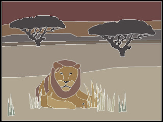
Due to my lack of natural drawing ability and patience to develop drawing skills, I have employed a few shortcuts to develop the cartoon for one of my pieces (pictured at left). I was charged by my client to create a piece with an African landscape/wildlife theme. I already had in my mind that I would like to show one or two animals relaxing or grazing on an savannah with a sunset in the background. My first step was to take a visit to the local zoos and snap as many pictures as I could of elephants, lions, giraffes, rhinos, etc. and decide which pictures would lend themselves best to this scene. The winning candidate was a lion enjoying the shade at the Fort Worth zoo (pictured below). Although the lion's pose was perfect for the idea that I had envisioned, there were a couple of problems. First, this is a young lion that had not yet grown its full mane, and for the sake of artistic effect I could not possibly forego the lion's most iconic characteristic. Secondly, how th

Garden Inspiration and Lessons Learned

Image
I'm not sure how much of it is attributed to luck, but this spring has brought some of the most brilliant color in my short tenure as a novice gardener. Last year's stragglers, including my lacecap hydrangea, have kept pace with the perennial stalwarts (hostas, Confederate jasmine, Japanese holly ferns, etc.). I was excited a few weeks ago when I noticed that the hydrangea, which did not produce any blooms at all last year, was starting to bud out. After a day of steady rain last week, the blooms really started to pop. The last time this plant flowered, I was inspired to create one of my earliest mosaics. I remember being excited to use millefiori for the first time. A few lessons I learned from this piece were 1. carefully plan your design before cutting and gluing your tesserae, 2. be sure you have enough tile of the color you're using on said unplanned design before you start cutting and gluing and 3. be patient! Number 3 is still the most difficult lesson for me to foll

Portuguese Rooster

Image
My newest piece, which was finished earlier this week, portrays a rooster perched atop a hill. The rooster itself is not an original design, but came from a picture I took in Provincetown, Massachusetts a few summers ago. A large contingent of Portuguese sailors and their families settled in Provincetown in the early nineteenth century, and their cultural influence is still apparent in the village today. One such symbol of this heritage is a rooster painted on the pavement at the end of the public pier (as pictured below). According to legend, the rooster became a symbol of good fortune when a poor man was saved from death for a crime he didn't commit. Because my feeble memory of the story would not do it justice, I did a quick online search and found the following at Nancy's Portugal Site http://home.online.no/~nancys/portugal/country/rooster.html : The Rooster from Barcelos The Rooster from Barcelos has become a national symbol. It symbolises "The

Latest Work

Image
My latest completed work, which was finished a couple of weeks ago, was created for my friends' newborn son whose bedroom has a panda theme. It is composed of glass tile on a 10" x 10" MDF panel.