A new design approach
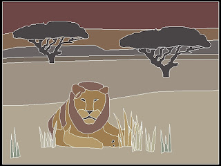
 Due to my lack of natural drawing ability and patience to develop drawing skills, I have employed a few shortcuts to develop the cartoon for one of my pieces (pictured at left).
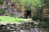
I was charged by my client to create a piece with an African landscape/wildlife theme. I already had in my mind that I would like to show one or two animals relaxing or grazing on an savannah with a sunset in the background. My first step was to take a visit to the local zoos and snap as many pictures as I could of elephants, lions, giraffes, rhinos, etc. and decide which pictures would lend themselves best to this scene. The winning candidate was a lion enjoying the shade at the Fort Worth zoo (pictured below).
 Although the lion's pose was perfect for the idea that I had envisioned, there were a couple of problems. First, this is a young lion that had not yet grown its full mane, and for the sake of artistic effect I could not possibly forego the lion's most iconic characteristic. Secondly, how the heck was I going to draw this thing? Luckily, I am quite skilled in AutoCAD, due to my engineering work. I imported the image into a CAD drawing and traced all of the lions features, including an improvised mane.
Now that the animal portion of the work was complete, I needed to flesh out the landscape. After sorting through hundreds of images online of African savannahs, I discovered that the acacia thorn tree (which looks to me like a giant umbrella) appeared in most of the landscapes. I found a picture of one that I liked, inserted it into my CAD drawing and traced it. After the first tree was finished, it was an easy task to copy it over and enlarge it for the second tree. The remainder of the landscape was completed by drawing in some small mountains on the horizon as well as some lines marking darkening color bands on the plain to represent distance. Now the linework was complete!
For coloring, I imported the CAD drawing into Gimp (a free program similar to Adobe Photoshop). I also took a picture of the tile sample board I intended to use for the project (Winckelmans unglazed porcelain) and imported it into Gimp as well. I was able to select colors from the photo of the sample board and used the Bucket Fill Tool to color in each section of the cartoon. One problem with this approach is that the photo of the sample board needed to be tweaked a little more so that the colors would more closely match the actual tile. As it turned out, the colors are a lot flatter and grayer than the actual tile. However, I can still get a fairly good idea how the colors work together.
My next step will be to print the linework to the actual size of my substrate (16"x12" MDF in this case). I still have a few minor tweaks I would like to make to the cartoon before printing. Once it is printed, I will use transfer paper to trace the image onto the MDF. Then I will use a Sharpie to draw over the tracing to make it stand out. At this point, I will be ready to start cutting and placing tile.


Creative design approach- great results! A thought on the Sharpie though. That's setting off alarm bells in my head. I seem to remember reading it can bleed up through grout. Dark pencil would also work.
ReplyDeleteYikes, Linda! I did not know that about using a Sharpie. I have plenty of pencils that will do the trick. Thanks for the tip.
ReplyDelete